Thursday, November 18, 2010

Class 7


Brushes
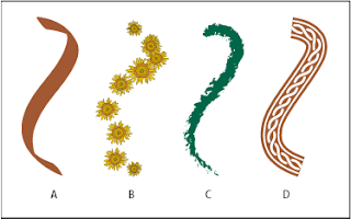
Illustrator's brushes let you draw variable, freehand brush strokes or apply a texture, pattern or shapes to a path with all of the advantages of vector graphics. Brushes can be accessed from the little brush icon on the panel menu, or go to Window>Brushes.

To apply a brush stroke, you can either choose the Paintbrush tool, and draw a freehand stroke, or you can apply a brush stroke to an existing path, To change the contour of a stroke, simply reshape the path with a white arrow (direct selection) tool. Brushes are also live, so you can edit a brush, then apply the revised brush to your existing paths.

There are 4 types of brushes:

Calligraphic brushes
Create strokes that resemble those drawn with the angled point of a calligraphic pen and are drawn along the center of the path.

Scatter brushes
Disperse copies of an object (such as a ladybug or a leaf) along the path.

Art brushes
Stretch a brush shape (such as Rough Charcoal) or object shape evenly along the length of the path.

Pattern brushes
Paint a pattern—made of individual tiles—that repeats along the path. Pattern brushes can include up to five tiles, for the sides, inner corner, outer corner, beginning, and end of the pattern.


Blends
Blends are multi-step color and shape progressions between two or more objects, connected by an invisible spine. While you can't edit the transitional objects in a blend directly, the whole blend will update instantly if you edit the original blend objects, or reshape the spine.

Object>Blend>Blend Options

Color Notes


Some Basics
Additive vs. Subtractive
RGB uses additive color mixing, because it describes what kind of light needs to be emitted to produce a given color. Light is added together to create form from out of the darkness. RGB stores individual values for red, green and blue. RGBA is RGB with an additional channel, alpha, to indicate transparency.

CMYK uses subtractive color mixing used in the printing process, because it describes what kind of inks need to be applied so the light reflected from the substrate and through the inks produces a given color. One starts with a white substrate (canvas, page, etc.), and uses ink to subtract color from white to create an image. CMYK stores ink values for cyan, magenta, yellow and black. There are many CMYK color spaces for different sets of inks, substrates, and press characteristics (which change the dot gain or transfer function for each ink and thus change the appearance).

Gamut-Gamut is the term for the range of colors that can be represented in a given color model (RGB, CMYK, etc.) or a given output device (computer monitor, desktop printer, 4 color process, etc.). In Adobe programs, you can see when a selected color is out of gamut by the little triangle shaped warning sign that appears next to the color.

Color Space-The gamut, or available color range, of a device is called the "color space" of that device.

Color Profiles-The mathematical description of a device's color space is called the "color profile."

Color Management- A color management system (such as Adobe's) acts as the color interpreter, and uses the color profile of a given output device (printer) to keep your colors looking accurate.

In Illustrator, most color management controls can be found under Edit>Color Settings. When you place your mouse over a setting, you'll get a handy dialog box telling you the best circumstances to use various color profiles and management policies.

In light of the new capabilities of digital imaging it is recommended that you work in the RGB color space. Keep an original archive of the image in RGB format for additional jobs run on different output devices. Once a file is saved in a smaller color space, such as CMYK, the colors outside of that space are lost. Resaving the file in RGB will not replace the missing colors. Let your service provider modify the color space to best suit your output needs. It’s a good idea to contact your service provider and discuss color issues if you have any questions concerning color space requirements.

Here's a handy site with some useful printing tips: http://www.printernational.org/

Thursday, November 11, 2010

Class 6


Importing and Editing Raster Images
Today's lesson will cover Acquiring raster images in Illustrator, as well as prepping for print.

There are several different ways to get a raster image into Illustrator:
File>Open
File>Place
Drag and Drop

• Linked Files
A link is a placeholder image that links to an accompanying raster file. This keeps your file from getting too large, but to edit you must either open the original application or embed the image into the Illustrator document. In order to print properly, the original file must be available on the hard drive.

Recommended Formats for Linked Images: EPS, TIFF, PDF

• Embedded Files
Embedded files are actual raster objects placed into the Illustrator document. This allows for some editing, but at the cost of larger file size. If you are importing a layered Photoshop Document, you can choose whether to flatten the image, or bring all of the layers over as a group (with each Photoshop layer nested in sub-layers.)

A bitmap that you aquire in illustrator via the Open, Place, or Drag-and-drop method can be moved, placed on a different layer, masked, modified using any transformation tool, or modified using raster filters. All three methods preserve the resolution of the original image.

Effects

Effects
-Change the appearance of the path (editable in the Appearance panel) and can be edited or deleted at any time. When you edit the underlying path, the effects adjust accordingly. You can even apply effects to editable type! With a few exceptions, effects are vector, and output as vectors.

The Photoshop Effects (on the bottom part of the Effects Menu) are all raster, meaning they're rasterized on output even when exported to a vector format.

You can control the rasterization process by choosing Effect>Document Raster Effects Settings.

Printing Checklist
Save as EPS

Flatten Transparencies

Convert All Type to Outlines

Make sure all raster images are at least 300dpi

Make sure the document is CMYK. The Visual Quickstart Guide suggests converting any raster images to CMYK in Photoshop, saving them as a PSD, then using the Place command to acquire the image.

Where possible, link files rather than embed them.

Thursday, October 28, 2010

Project Ideas

Hopefully you all are starting to understand the fundamentals of Illustrator: getting around the interface, creating, moving and manipulating shapes, and the basics of type. For the second part of the semester, I would like to lead you through some self-directed projects that we will work on in class. These will give you an opportunity to apply your new found skills in practical, real world situations.

These will be fairly open ended assignments, but I do want each project to include 3 elements:

• Dominant Type (Title)
• Subordinate Type (Info)
• A Graphic or Illustrative Element

Your "homework" each week will be to come up with ideas, sketches, or materials to work with while in the class.

Here is a list of possible project ideas to take inspiration from. Let's see how many we can get done!

1. Logo- Personal, Business

2. Business Cards- Personal, Business, Fun

3. Greeting Cards- Holidays, Birthdays, Anniversaries

4. Labels- Beer, Wine, Soap, Food, Cosmetics, etc.

5. Promotional Fliers- Events, Business

6. CD covers- Music, Portfolios, Promotional

7. Posters- Movie, Concert, Event

Class 4


Stroke Palette:
To access the stroke palette, click on the menu icon with the 4 rows of lines on it, or go to Window>Stroke to bring up the panel.

Cap Buttons- The cap buttons modify the endpoints of a solid line, or all the dashes in a dashed line.

Join Buttons- The join buttons modify the bends on corner points (not curve points).

Miter Limit- Change the miter limit to control when a pointed corner becomes a beveled corner. A high miter limit value creates sharp, pointy corners, and a low miter limit value created blunt, beveled corners.

Dashed Line- Check the dashed line box to convert a regular stroke into a dashed line. Use the cap buttons to change the shape of the dash, and enter point values in the dash and gap fields to change the size and spacing.
* Dotted Line trick- To create a dotted line, click the rounded cap button, enter a dash value of 0, and enter a gap value greater or equal to the stroke weight.

Gradients

Transparency
To access the Transparency palette, click on the menu icon with the Venn Diagram symbol on it, or go to Window>Transparency to bring up the panel.

-Opacity- The opacity setting controls the transparency of an object.

-Blending Mode- These filters control how transparent colors are affected by underlying objects.

Transparencies can get really screwed up on press. An important step when prepping files for output is to flatten transparencies using Object>Flatten Transparency.

Masks
1. Arrange the object or objects to masked. You can group them or not. To avoid printing errors, don't use super intricate objects.

2.Put the masking object (called the clipping path) in front of the objects it will be masking. If you need to resteack it, on the layers panel, drag its name upward on the list.

3. Choose the selection tool (black arrow).

4. Select the clipping path (masking shape) and the objects to be masked.

5. Choose Object>Clipping Mask>Make Clipping Mask

*The clipping path (masking shape) will now have a stroke and fill of None, and all the objects will remain selected. The words "Clipping Path" will appear on the Layers panel, and the masking shape and all of the masked objects will be moved it a clipping set.


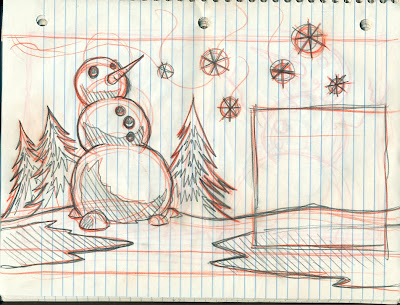
Assignment: Let's return to the snowman design from earlier, this time adding type, transparency, and gradients.

"Winter-Time
by Robert Louis Stevenson

Late lies the wintry sun a-bed,
A frosty, fiery sleepy-head;
Blinks but an hour or two; and then,
A blood-red orange, sets again.

Before the stars have left the skies,
At morning in the dark I rise;
And shivering in my nakedness,
By the cold candle, bathe and dress.

Close by the jolly fire I sit
To warm my frozen bones a bit;
Or with a reindeer-sled, explore
The colder countries round the door.

When to go out, my nurse doth wrap
Me in my comforter and cap;
The cold wind burns my face, and blows
Its frosty pepper up my nose.

Black are my steps on silver sod;
Thick blows my frosty breath abroad;
And tree and house, and hill and lake,
Are frosted like a wedding cake."

Thursday, October 14, 2010

Class 3 Files


History of Type

Typography is the art and technique of arranging type, type design, and modifying type glyphs. Type glyphs are created and modified using a variety of illustration techniques. The arrangement of type involves the selection of typefaces, point size, line length, leading (line spacing), adjusting the spaces between groups of letters (tracking) and adjusting the space between pairs of letters (kerning).
Typography is performed by typesetters, compositors, typographers, graphic designers, art directors, comic book artists, graffiti artists, and clerical workers. Until the Digital Age, typography was a specialized occupation. Digitization opened up typography to new generations of visual designers and lay users.
Typography traces its origins to the first punches and dies used to make seals and currency in ancient times. The typographical principle, that is the creation of a complete text by reusing identical characters, was first realized in the Phaistos Disc, an enigmatic Minoan print item from Crete, Greece, which dates between 1850 and 1600 BC. It has been put forward that Roman lead pipe inscriptions were created by movable type printing, but this view has been recently dismissed by the German typographer Herbert Brekle.
The essential criterion of type identity was met by medieval print artifacts such as the Latin Pruefening Abbey inscription of 1119 which was created by the same technique as the Phaistos disc. In the northern Italian town of Cividale, there is a Venetian silver retable from ca. 1200 which had been printed by the means of individual letter punches. The same printing technique can apparently be found in 10th to 12th century Byzantine staurotheca and lipsanotheca. Individual letter tiles where the words are formed by assembling single letter tiles in the desired order were reasonably widespread in medieval Northern Europe.
Modern movable type, along with the mechanical printing press, was invented in mid-15th century Europe by the German goldsmith Johannes Gutenberg. His type pieces from a lead-based alloy suited printing purposes so well that the alloy is still used today.[12] Gutenberg developed specialised techniques for casting and combining cheap copies of letterpunches in the vast quantities required to print multiple copies of texts; this technical breakthrough became instrumental for the success of the almost instantly starting Printing Revolution.
Typography with movable type was separately invented in 11th-century China. Metal type was first invented in Korea during the Goryeo Dynasty around 1230. Both hand printing systems, however, were only sporadically used and discontinued after the introduction of Western lead type and the printing press.

Class #3 Text

Today we're going to cover some of the basics of text editing in Illustrator.

The Tools:
There are three horizontal type tools: The Type tool, the Area Type tool, and the Type on a path tool. Each of these has a vertical counterpoint.

• Type Tool- Creates a block of type that isn't associated with a path. You can also draw a rectangle with it and enter type inside the rectangle; you can use it to enter type along the edge of an open path; or you can use it to enter type inside a closed path. It is the most versatile of all type tools.

• Area Type Tool- Creates type inside an open or closed path. Lines of type that are create with this tool automatically wrap inside the path.

• Type on a Path Tool- Creates a line of type along the outer edge of an open or closed path.

Character Window
To open the Character Window, click on the "A" symbol on the right hand panel, or go to Window>Type>Character in menu bar at the top of the screen. This window allows you to change fonts, sizes, and letter spacing. Basically, all of your word processing functions.


Point Type/Text box
If you simply click on a blank section of the art board, you can immediately start typing away. This is called Point Type. It is neither inside an object nor along a path. This kind of type is appropriate for small amounts of text that stand independently, such as headlines and titles.

With the type tool selected, you can also create a text container, by dragging the mouse to create a rectangle. When you release the mouse, a flashing marker will appear, and you can being typing. Type inside this container will wrap automatically to fit the area, making this tool perfect for paragraphs and other large bodies of text.

*You can edit the shape of the text container after the fact, and the type will readjust itself accordingly.


Import text
Bringing in text from an outside source is easy. The simplest method is:
-Copy type from a word processor, web-page, or other source (Command+C)
-Then, in Illustrator, click on the artboard with the type tool (or drag a text container)
-Paste (Command+V).

This is often a good idea when dealing with lots of text, because you can take advantage of the more comprehensive spellcheck and grammar check of word processors.

Area Type
To fill a closed object with type, use the Area Type tool. Click on the edge of a shape, and a flashing marker will appear. The fill and stroke of the path will disappear, and you can begin writing or pasting text. Like a text container, the type will hug the contours of the shape automatically.


Type on a Path/Type on an Ellipse, etc.
To create text along the outside of a shape, use the Type on a Path Tool. Much like the area type tool, just click on the outside edge to begin typing. Don't hit return or enter though, this tools works for single lines of type.

The selection arrows allow you to edit the positioning of this type after the fact. When you click on the type, 3 brackets will appear.
• The left bracket adjusts the starting point
• The right bracket adjusts how much type shows
• The Center bracket moves the type along the path.

Type on a Path options:
To edit the appearance of type on a path, go to the top of your screen at click Type>Type on a Path>Type on a Path options.
This allows you to move the type inside the path, outside the path, and flip it's orientation.


Type Effects
At the top of the screen under Effects>Warp, there are various preset type effects, similar to those in Photoshop. Try them out for neat effects!

Appearance Panel: To re-edit effects after they've been committed, use the Appearance Panel. If you can't find it, click on Window>Appearance, up at the top of the screen.


Create Outlines
Type in illustrator isn't editable in the way shapes are. They remain a separate entity so that text can be edited over and over. If you're happy with your spelling and word choices, but need to edit the individual letters as shapes, then you'll need to turn the type to outlines.

Simply highlight the text, then go to Type>Create Outlines. Now your letters have turned into editable shapes. They may still be grouped together, but you can fix that by going to Object>Ungroup.